For the past 6 months, I have been working mostly on UI. And it is real fun to see your code reflect beautiful elements on a web page. Fixing paddings and margins (almost) everyday have taught me basic principles of design and why they are important. So if you are starting out in web design, maybe this blog can clear some things out.
Introduction
I joined my company 6 months ago, and I was introduced to our flagship product ERPNext. For a fresher like me, UI seemed easier to get started with the codebase. So, I started fixing UI issues.
While fixing these issues, I made sure the elements look like a part of the product. The font-size, margin, padding, etc must be similar to what neighbouring elements used. In other words, consistency in design.
Stealing design
As months passed by, I started working on larger projects. One of them was Gantt. I had to make a gantt chart based on a number of tasks given with start and end date. Also, I had to make them look good to complement our product’s theme.
Honestly, I was not good at UI. I take inspiration (steal shamelessly) from other apps/websites with good design. I am not even kidding, I literally copy their html/css and modify it accordingly.
So, I started searching for gantt charts on the web. Google Gantt Chart looked good. So I started marking up html (and svg), keeping Google Gantt Chart in another tab for reference. In a couple of days I had something similar to Google’s design.
 Google Gantt Chart (Left), Frappé Gantt (Right)
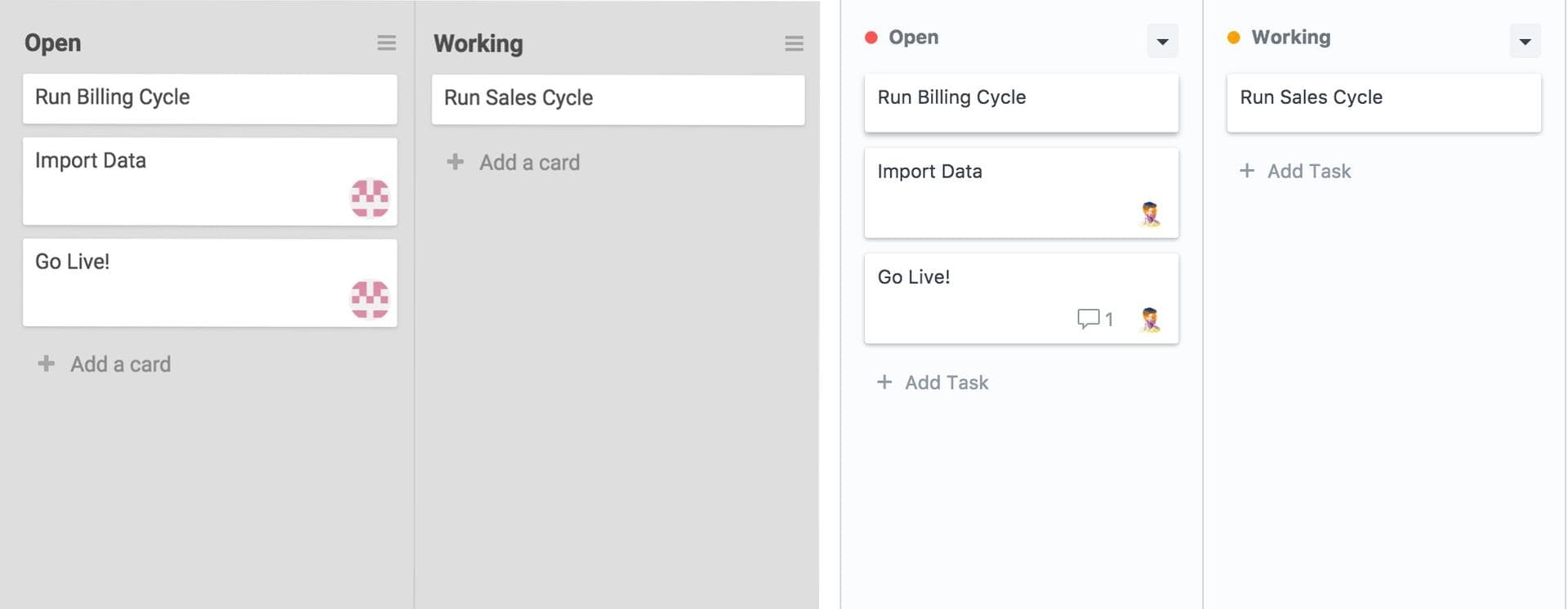
Another project of mine was Kanban Boards. You guessed it right, this time my inspiration were Trello and Wekan.
 Wekan (Left), Kanban in ERPNext (Right)
When I steal good design, I get to know the thought process of the original designer (somewhat), like why were certain things laid out in a certain way.
Bad design
There are times when you know something has a bad design, but you can’t really identify the problem. This happened to me a lot. I read this book, which teaches just that while also explaining basic principles of design with lots of examples.
I also think that good design is something you develop a taste for. So, when you spend more time with good design, you start identifying the bad ones.
Let’s go through some concepts I learned about design.
1. Keep it consistent
Code reuse and consistency go hand-in-hand, when you build small components, you can reuse them across your product. Simple way to achieve consistency.
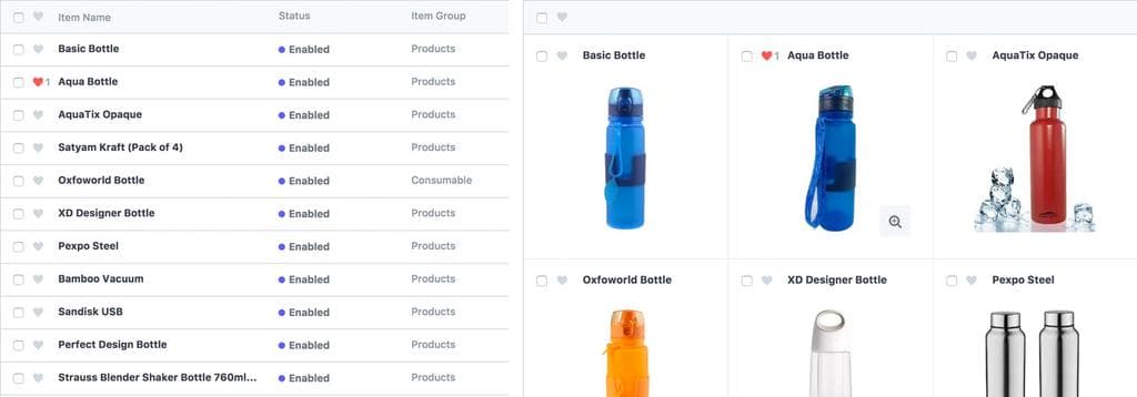
Let’s take a look at the List view and Image view in ERPNext.
 List view (left), Image view (Right)
The title area comprised of checkbox, heart icon and name is common, and makes the UI consistent.
2. Use more whitespace
When you start laying out your app, you start with 100% whitespace. As you start adding elements, you take out the whitespace. But whitespace is important, it gives breathing room to your elements. When you look at some website, and cannot figure out why does it look so good, it’s probably whitespace.
3. Use colors sparingly
Colors (especially warm ones) pop out and take your users attention. So when they do, make sure they are looking at something important.
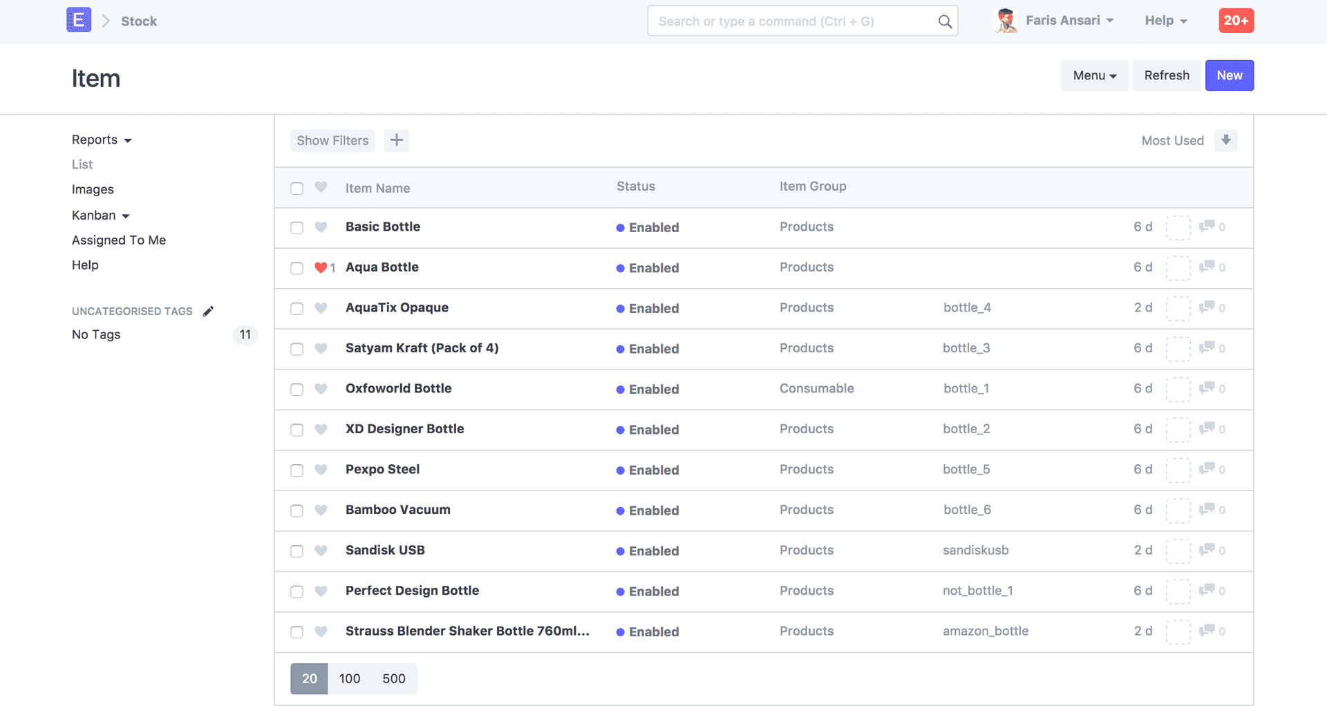
 Use of colors and whitespace in ERPNext
4. Put content first
Content is the first reason why your users use your app. Your design should build around your content. Not the other way round. You should mute away trivial information and put emphasis on important ones.
Take a look at the previous example, and find out for yourself which information is important and which one is muted away.
5. Make actions clear
Try to express the action and it’s outcome clearly. Label buttons according to the actions they perform.
For e.g, when you ask them ‘Are you sure you want to delete this item?’, your buttons should say ‘Delete’ and ‘Cancel’ instead of ‘Yes’ and ‘No’
I have tried to convert most of my thoughts related to design in words. I wish to learn more about design by designing great experiences for users. This is only the beginning. Happy designing!
